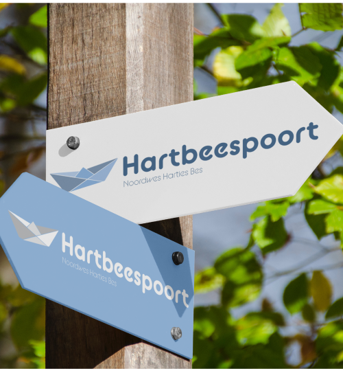
My Projects

Packaging

Nespresso

The concept for this project was Deco pods. The solution was to have a creative decorative way to display Nespresso pods in their box, making the box more than just packaging. The design was inspired by Art deco style to keep to the brand identity of luxury.

Illustration

Coffee mood match

Whether you drink your coffee black and strong or you prefer your creamy coffee confection we all have our flavours and personalities. The design space takes all different brews of people to be successful. So which one of these four characters suits your taste?

Branding

Hartbeespoort

Harties is a popular vacation town in the Northwest province and is known for the Hartbeespoort dam, the dam wall, a wonderful variety of markets and much more. There is a pleasant Afrikaans culture and a friendly atmosphere. The previous branding 
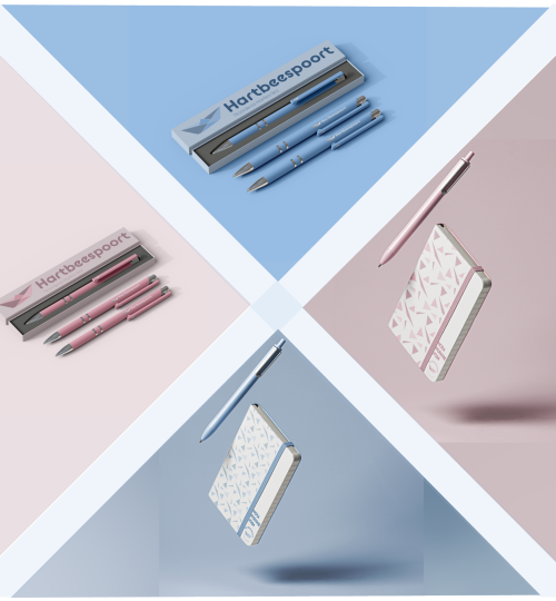
does not do these facts justice.The new branding is designed with this in mind. 
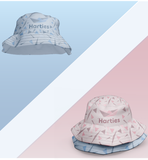
There is a saying that goes “Oos Wes, Tuis Bes” (no place like home) and for many Harties is like a home away from home. A person can say that Harties is the best in the Northwest

Campaign

Black Cat Peanut butter

The concept was ‘Just one more’. This concept rides on the addictiveness of peanut butter but also people’s love towards the healthy snack. The goal was to embrace the peanut power by having just one more wherever you are, encouraging people to enjouy a healthy snack.